Continuing the Star Wars Saga, Far from Doing it Solo…
by Neil Lamont, Production Designer and Al Bullock, Supervising Art Director
When we were asked to write about some of our experiences on Solo: A Star Wars Story, naturally, we delved into the back catalogue of past PERSPECTIVE editions to see what was expected of us. Here in the UK, there is no solely Art Department focussed periodical such as PERSPECTIVE, so it was with great pleasure that it quickly became obvious that the Art Department community as a whole across the UK, USA and Europe, are very much keeping alive those original Art Department techniques held dear to us, ingrained into us by our mentors, having been handed down through successive generations of Art Department crew. This spirit of constantly evolving ingenuity of approach to set design and building, by embracing new technologies, married with tried-and-tested traditional methods, is a potent and successful formula. When it’s taught to a newer and younger generation of craftspeople, it’s embraced and improved upon by them utilising the latest computer technologies and 3D printing, second nature to many of them, to interpret the original methodology and keep the spirit of Art Department innovation and creativity very much alive.
Some of the tools change, but the modus operandi of most Art Departments is largely similar. Directorial discussions with script, researchers mining for inspirational imagery, the location department looking for the strange and unusual, with an initial round of emotive concept art, honing initial ideas, some of which stick, some of which don’t, but all the time helping push on to the next phase creatively.
To best illustrate the approach to our whole design process, two environments in Solo in particular are representative of this; Corellia and Savareen. Each big and important sequences, both visually and emotionally, that bookend the movie and that are key to understanding the emotional journey that forms the Han Solo presented to us in Star Wars: Episode IV – A New Hope.
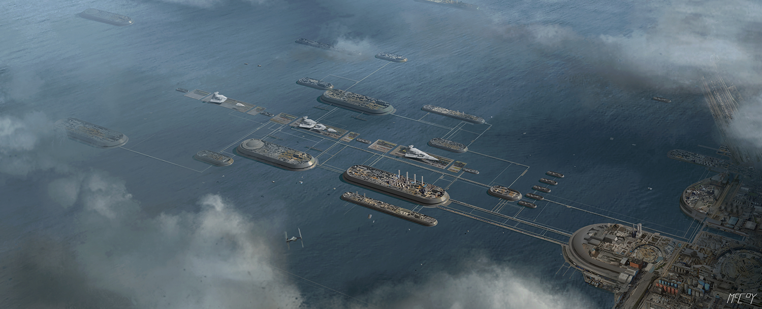
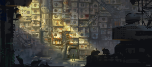
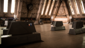
Corellia is a ship-building, industrial planet that forms the backdrop for a nail-biting speeder chase. Occupied by the Empire, it is a mire of poverty and hard luck stories. In amongst the favelas and street gangs, where the exploitative White Worms thrive, it is a place that would be somewhere one aspires to leave rather than ever have as a destination.
With all this in mind, the design approach here was to find a single industrial location, with plenty of roadways to service the fast-paced action of the sequence, upon which to build conceptually and literally. From an early stage in the concept work, the environment was to be a bridged network of connecting islands swathed in a hotchpotch of industry, engineering, transport hub and down-at- heel favela townships.
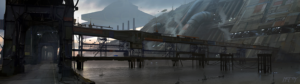

Despite all best efforts, two locations were required to satisfy all the story’s needs. For the bridge network over water, the grain terminal at Tilbury Docks in East London was used. Still an active and extremely busy cargo shipping facility, Tilbury naturally presented its own challenges too numerous to itemise.
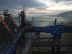
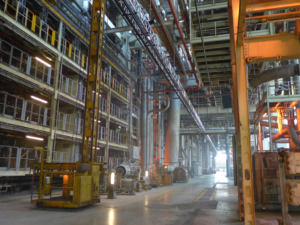
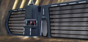
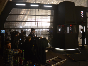
Secondly, Fawley Power Station was chosen for the remainder of the sequence, except what was shot back in Pinewood Studios. Fawley in its heyday was a 1960s state-of-the-art showpiece working power station, rich in industrial texture and infrastructure, it also held many pleasing ’60s- inspired design tropes. Now decommissioned, it was a race against the clock to shoot before demolition began to make way for a luxury development of the site.
Given a limitless budget (that sadly never happens!), one could spend endlessly trying to convert all the areas of the station that were used into fully finished sets. Therefore, key areas of the location were targeted that would require a larger effort, leaving the background to visual effects for a “small fix”! A key, and very telling exercise, that was undertaken very early on in preproduction to illustrate this, involved the design team perched within the back of a flatbed truck, acting as Han and Kira stand-ins, as the visual effects supervisor Rob Bredow took hand held 4K video, with a shallow depth of field, to see how the cross shots in a speeder cockpit would look with motion blur and foreground action, as we sped up and down the web of Fawley streets and alleyways. It became clear that the background was very forgiving and only tonal problems needed to be dealt with. It also, by the way, served as a good interdepartmental bonding exercise!
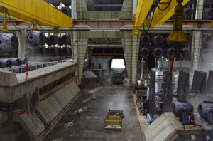
To justify the expense of a full crew location shoot at Fawley, two further Corellia sets were added to be built and shot there in amongst the existing structure; the entrance to the Den of White Worms and the fish market.
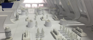
As we usually do, the Art Department produced a white card model of the location, along with the set elements we proposed to install there. We find this the most effective method of round table discussions to allow all departments, including visual effects, and first and second units, to plan efficiently. We also use a lipstick camera, popular with directors for composing shots, to ensure that all necessary requirements in construction and set decoration have been dealt with.
Considering the vast size of the Fawley site, both the property and set decoration departments ensured that all the pieces they supplied were easily moveable to shot, or even able to leapfrog from one setup to another in an effort to service the needs of both units, that often were shooting at the same time.
Of course, the role of the location department, and the Art Department’s relationship with them is a very important element to this whole endeavour. The effort this department puts into not only location finding, acquiring and gaining permissions, but also facilitating construction, set dressing and generally servicing the endless needs of the crew, along with the final clear-up, is nothing short of phenomenal. Hats off to locations!
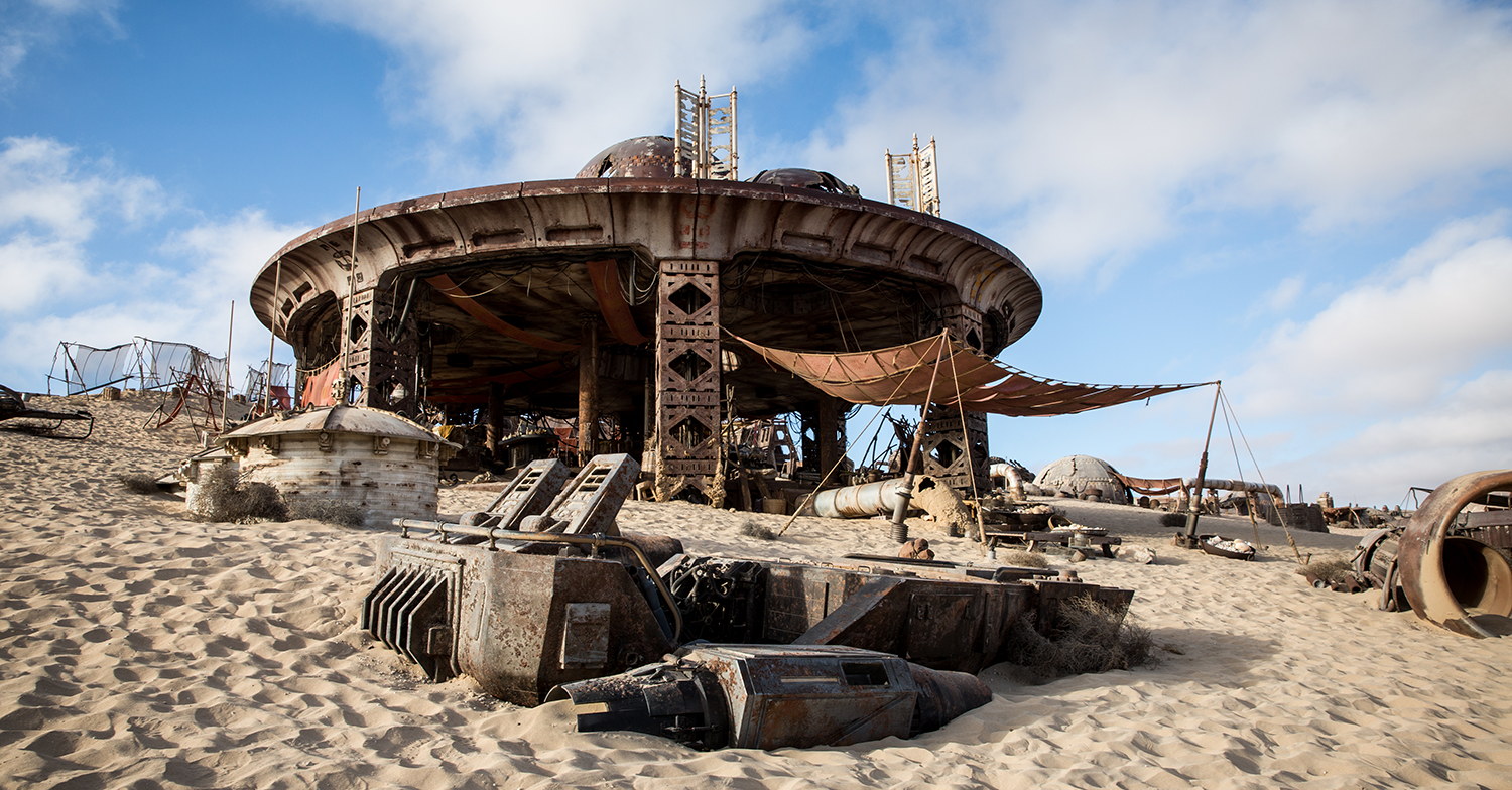
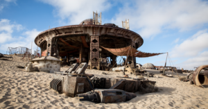
Savareen—the final key environment in Solo is an arid desert planet, characterized by rolling desert sand dunes that run right up to the coastline and down to the sea’s edge. Like Corellia, it is supposed to be in another forgotten corner of the galaxy.
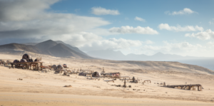
The search for the right location was typically thorough and global in nature, with a shortlist of South Africa, Namibia, Morocco and the Canary Islands as a result. Fuerteventura in the Canary Islands off the west coast of Africa ticked all the boxes and came out on top as where the production was going to build and shoot the ramshackle and decrepit Coaxium Distillery, target destination at the end of the famed Kessel Run.
As is often the case, this was not going to be simple! Not only due to the size and complexity of the construction, the density of set dressing and props, the limited access and remote position of a site extremely exposed to the harsh weather elements, but it also happened to be a national park with all the associated ecological considerations and restrictions associated with it. After the location and production team tirelessly navigated the often nerve-jangling permissions process, the go-ahead was finally given at the eleventh hour to commence construction. To allow this to happen, a temporary but resilient enough access road network had to be installed to service the set and various production bases. A condition of the permission being granted was that after shooting was complete and every bit of set, infrastructure and debris had been struck, the site was to be returned to its original state. This is an undertaking that is taken extremely seriously.
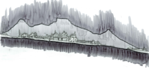
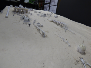
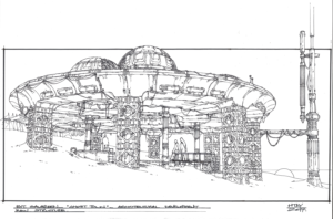
The set itself was developed with the concept team, and we had always liked the notion that the distillery was slowly but steadily been taken over by the natural and harsh habitat; engulfed by the sand dunes. The concept team did some preliminary artwork based on Neil’s brief, and also on his key elevation sketch. As a result, a set layout plan was generated and an Art Department concept model rapidly produced at one-sixteenth scale.
This model provided an invaluable resource tool for the technical scout of the site in Fuerteventuera, along with some rudimentary staking out of key set pieces in situ. Being able to orientate the model correctly, make position changes where required and learn valuable information regarding sun path and corresponding daily requirements and routine for shooting at sunrise and set, and where to have cover during periods of high sun.
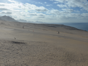
The site itself was a vast, sloping ten-degree incline, with unstable and ever-shifting wind swept sand dunes running down to soft but sheer sea cliffs…this was not going to be easy! Wisely, construction manager Paul Hayes decided to prefabricate as much of the set in the UK workshops as possible before being shipped overseas, assembled and finished in the dunes, ever mindful of the ecological considerations. The expertise and hard work of the talented construction, props and greens teams from the UK, helped by some local crew, delivered something that was truly breathtaking.
The nature of what makes a true Star Wars design is often discussed. We have been lucky enough to have been involved with several of this current series of films now and have noticed that the essence of the Star Wars aesthetic is tricky to describe but is recognisable. It’s an unwritten language, style, shape, colour, that grows within as time goes by. Drawing comparisons with the nature of The Force may be stretching it a bit, but it’s tempting! One can be walking through the studio, past the dumpsters, and find oneself imagining it upside down, painted white (Star Wars white, of course), dressed with strategic patches of “gack” or “greeblies,” add a bleached stripe of red/orange and some deft ageing from the painters, and before you know it, have an effective and perhaps key piece of Rebel dressing for one of the sets. Even the lids from these same dumpsters have been put to use: they look great as a pressed metal Star Wars ceiling panel! If not “Rebel,” one can also lean toward “Empire.” It’s great to see both sides, light and dark, good and evil.
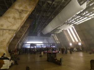
There are a few in this Art Department who have had a little more time to gain this design understanding, having also been involved in Episode V – The Empire Strikes Back, and Episode VI – The Return of the Jedi. With that experience in mind, we often state that we consider Solo, and Rogue One to be “period” movies, rather than simply as “sci-fi.” We have the ability to referencethe original trilogy and evoke a 1975-1981 Star Wars style. Specifically, with Rogue One, 1974, and for Solo, dialling the design into the late ’60s—early ’70s aesthetic. “Retro” and “Lo-fi,” taking the best of the technological world in that time and reimagining it for Star Wars. The control room at Fawley power station (previously seen briefly in Rollerball behind James Caan) was a great source of inspiration. We walked in there and loved it. Its shapes, lines, colour and simplicity…Wow!
Our colour palettes are very simple, too. As we embarked on Rogue One, we realised that there were at least twenty established silvers to black in the Empire range alone. We simplified this down to seven, with or without sheen, and three whites, all established in past films.
For this whole design process to run smoothly, effectively and most importantly creatively, good relationships are key. A collaborative approach between all departments not only makes for a more harmonious and enjoyable working atmosphere in what can often be very demanding circumstances, but also ultimately results in a more efficient moviemaking mechanism. Good interpersonal relationships are often at the heart of this, be it within the extremely talented Art Department crew, or with crew from other departments. Regarding our immediate Art Department sphere that’s under our spotlight here, Neil Lamont sums this up nicely.
“The relationship between the four key individuals, the Production Designer (Neil Lamont), the Supervising Art Director (Al Bullock), the construction manager (Paul Hayes) and the set decorator (Lee Sandales) is so important. We have a shorthand between us, and having been promoted to Production Designer, I have found it difficult to relinquish some of my old Supervising Art Director role and habits.
“I have come to terms with this now, walking away from areas and situations I’m no longer needed in, and allowing the Supervising Art Director and construction manager to sort out. This does sometimes create a few last-minute problems as I’m left on my own for a final set walk-through. Seeing an opportunity to add to or improve the set, I announce, ‘It’s my birthday today!’ (…sometimes for the third time that week). Al and Paul roll their eyes, ‘Again!’ They too have come to terms with the regularity of ‘my birthdays’ as we all agree that going the extra yard will only ever improve the final look of the sets that so many people have worked so hard on to deliver.”
THIS ARTICLE FIRST APPEARED IN THE JULY/AUGUST 2018 EDITION OF THE ADG’S ‘PERSPECTIVE’ MAGAZINE.